Confirm-Shaming in Subscription UX
Guilt-based design tactics push one in five users to subscribe against their better judgment.
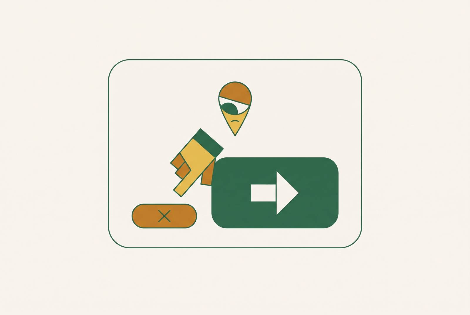
Confirm-shaming is a specific dark pattern in UX design: it guilts a user into opting into something by making the decline option sound pathetic, selfish, or stupid. UX designer Harry Brignull coined the term, and his definition is blunt: "the act of guilting the user into opting into something." The trick lives in one place, the button you use to say no, and once you know where to look, it's hard to unsee.
Brignull's broader taxonomy of dark patterns covers multiple types, including false urgency, basket sneaking, confirm-shaming, and others across the deceptive design landscape. Confirm-shaming sits among them as its own category, distinct because of where the manipulation is placed. In most dark patterns, the deception happens in the offer itself, in a hidden fee, a fake countdown clock, or a pre-checked box. Confirm-shaming doesn't touch the offer. The "yes" button stays perfectly neutral, something like "Yes, sign me up." All the weight gets loaded onto the "no."
Classic examples make this obvious once you see them lined up. "No, I don't want to save money." "No, I don't like helping those in need." Some sites go further and label you outright, slapping a "HATER" tag on anyone who declines to join an email list. None of that language describes the actual choice being made, which is just whether to hand over an email address or a few dollars. It describes you, or tries to, and that's the entire mechanism.
Why confirm-shaming works on people who know better
Three psychological levers do the heavy lifting here, and none of them require the user to be gullible. Loss aversion is the first: framing a decline as "missing out" activates a fear response that's stronger, pound for pound, than the pull of an equivalent gain. Social identity is the second, and it's the one confirm-shaming leans on hardest. Telling someone "no, I don't care about people in need" is accusing them of being a certain kind of person. It's accusing them of being a certain kind of person, and most people would rather click a button than sit with that accusation for even half a second.
Decision fatigue closes the loop. Research on dark patterns broadly notes that these tactics exploit cognitive biases and thin attention spans, but confirm-shaming does something more targeted than most. Under cognitive load, a lot of users just default to whatever path removes the discomfort fastest. Reading and rejecting a guilt-trip line takes more mental effort than clicking past it. So people click past it.
The data backs this up in a way that should unsettle anyone who assumes they're immune. A study by Strahilevitz found that users exposed to confirm-shaming signed up for a questionable program 20% of the time. These weren't people who misunderstood the offer. They could read both button options fine. They signed up anyway, 1 in 5 of them, because the discomfort of clicking "no, I don't want to save money" outweighed their actual assessment of whether they wanted the program. That's the framing overriding the rational read entirely, not a comprehension failure. That's the framing overriding the rational read entirely, which is exactly what the tactic is built to do.
How confirm-shaming is deployed specifically inside subscription cancellation flows
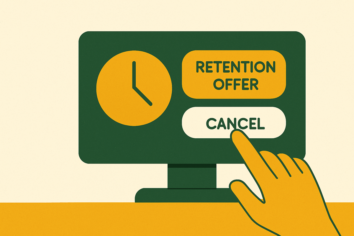
Subscription products are where confirm-shaming gets its most refined use, and the evidence for that comes from a study by the ECCE, which analyzed six named services: The Economist, Bloomberg, Scribd, Adobe Creative, Amazon Prime, and Audible. Researchers subscribed to each one, then cancelled, between March and May of 2025, and catalogued which dark patterns appeared along the way.
Loss Aversion Manipulation appeared in five of the six services, the single most common pattern found. Emotional Exploitation, Hidden Options, and Navigation Barriers each appeared in four of the six. Forced Interactions, Visual Manipulation, and High Effort Cancellation weren't far behind. Confirm-shaming is frequently deployed deep within cancellation flows, at points where a user has already signaled intent to leave, rather than earlier in the experience.
The formats repeat across services, even when the branding differs.
Some services offer to pause instead of cancel, presenting a decline button that reads something like "No, I'd rather lose access."
- The benefit reminder: a screen lists everything you'll lose, then asks you to dismiss it with copy like "I don't need [stated benefit]."
- The multi-step maze: cancellation flows insert a shame screen as one obstacle among several, so even users who click through it still have more friction ahead.
None of these screens are accidents. They sit at the exact point in the flow where a company knows intent to leave is highest, which is precisely why the copy gets sharpest there.
The measurable cost to users: what confirm-shaming and its surrounding patterns extract
Start with the gap, because it's the clearest evidence that something in the system is working against users' own awareness of their spending. C+R Research found that Americans spend $219 a month on subscriptions on average, but estimate their own spending at just $86. That's a 2.5x gap between what people think they're paying and what they're actually paying, and 89% of consumers underestimate their monthly subscription costs.
Some of that gap is pure forgetting. 42% of people admit they've completely forgotten about a subscription while still being charged for it, month after month. Confirm-shaming plays a role here too, in a less obvious way: it doesn't just push people to sign up, it makes people who did remember and did want to cancel reluctant to follow through, because the cancellation screen made them feel bad about wanting out.
Subscription sprawl is getting worse, not better. A survey by Self Financial found the average person now holds 3.4 active paid subscriptions, up from 2.8 in 2025. That's the direction things are moving: more subscriptions per household, not fewer, even as awareness of the problem grows. YouGov and CNET found that of the roughly $1,080 the average person spends annually on subscriptions, about $205 goes toward subscriptions that are unused or flat-out forgotten. Friction-heavy cancellation flows and the hesitation they produce are among the mechanisms feeding that $205, alongside plain forgetting.
Regulatory response and enforcement gaps
Regulators have started treating this as more than a UX quibble, and three enforcement actions show how far the penalties have escalated. The FTC secured a $2.5 billion settlement from Amazon in September 2025, the largest civil penalty in the history of an FTC rule-violation case: $1 billion in penalties alone, with the remaining $1.5 billion going to consumer redress. The complaint alleged deceptive Prime enrollment, known internally as the "Iliad Flow," alongside deliberate obstruction of the cancellation process. The court also ordered interface changes, not just a check.
Adobe followed in March 2026 with a $150 million settlement with a federal enforcement agency, after an FTC referral, split between $75 million in civil penalties and $75 million in free services owed to customers. The complaint specifically named the "Annual Paid Monthly" plan being set as the default option, an Early Termination Fee buried behind an easy-to-miss hyperlink, and a cancellation process built, in the government's words, as a maze of obstacles.
Care.com settled for $8 million in the summer of 2025, and this one's notable for the language the FTC used rather than the dollar figure. Regulators called Care's cancellation page a "dark pattern" outright, in an official complaint. That's the vocabulary of a UX researcher appearing in federal enforcement language, which says something about how seriously the term has been taken up.
The enforcement picture isn't uniformly a success story. The FTC finalized its Click-to-Cancel rule in October 2024, which would have required cancellation to be exactly as easy as signup, no phone calls or hidden menus required. A federal court struck the rule down in 2025, ruling that the FTC had failed to conduct a required preliminary cost-benefit analysis. The rule was blocked before it was set to take effect, which means the exact protection this piece is describing the need for doesn't currently exist as federal policy.
Pressure is building elsewhere. An EU sweep of retail websites in 2025 found that nearly 40% of online stores were concealing information or using visual trickery in checkout flows. Businesses were warned, and new EU consumer protection rules aimed at banning these practices outright are currently in development. Meanwhile, the FTC has continued expanding its enforcement approach, pushing for remedies that go beyond financial penalties to require operational changes at the companies involved.
Recognizing confirm-shaming in the moment: what the language patterns look like
The tell is structural, and it's more reliable than any single phrase. Look at the "yes" button first. If it's neutral, plain, factual, that's normal. Then look at the "no" button. If it reframes your identity, your intelligence, or your character instead of just declining the offer, that asymmetry is the pattern. One button describes a transaction. The other button describes you.
Four constructions appear repeatedly across industries.
Another pattern is the self-sabotage frame: "No, I don't want to save money," or "No, I prefer paying full price." The character accusation follows a similar shape: "No, I don't care about [cause or benefit]."
- The loss statement: "No, I'd rather miss out on exclusive offers."
- The identity label: "I'm not interested in improving myself," or bluntly, "I'm a quitter."
Subscription cancellation flows tend to use a quieter version of this. Instead of an explicit character judgment, the screen asks something like "Are you sure you want to lose access to [list of features]?" with a dismiss option that reads "Yes, cancel and lose everything." No one's calling you a hater here. The shame is baked into the consequence framing instead, which makes it subtler and, for a lot of users, just as effective.
Visual design amplifies all of this. The "yes" button is usually large, colorful, and styled like the primary action. The "no" option shrinks down to grey text, tucked somewhere easy to miss. Across major subscription services analyzed, 77.5% intentionally used confusing design elements, interface interference stacked directly on top of the guilt copy, so the visual hierarchy and the language are both working the same angle at once.
How to respond to it and stop it from costing you money passively
Naming the pattern is the fastest way to break its grip. Before clicking anything on a cancellation or signup screen, taking half a second to notice whether the decline button is trying to make the user feel like a bad person for clicking it can break the pattern. Once that's identified consciously, the emotional charge behind it tends to collapse. Confirm-shaming depends on an automatic reaction; naming it turns the automatic into the deliberate, and deliberate choices don't fall for guilt copy nearly as often.
Know the terms before starting the cancellation process, not during it. Plenty of services still require a phone call to cancel, even when signup took thirty seconds online. Knowing that going in removes the surprise that so often triggers giving up halfway through and just staying subscribed.
Free trials deserve their own defense, because a meaningful share of people report forgetting to cancel a trial before it converted into a paid subscription. Set two reminders the moment a trial starts, not the day it ends. One reminder seven days out, to actually evaluate whether the product's worth keeping. Another three days out, to make the final call. Waiting until the last day manufactures urgency, and urgency is exactly the condition confirm-shaming is built to exploit.
None of this holds if it's treated as a one-time fix, either. Self Financial's survey found subscription counts trending upward, from 2.8 active subscriptions per person in 2025 to 3.4 in 2026. A single cleanup pass through your accounts gets outdated fast. The habit that actually works is checking in on what's active, what's forgotten, and what's quietly draining money every month, on a schedule.
Sources
- Dark Patterns
- Dark patterns in subscription service cancellation processes | Proceedings of the 36th Annual Conference of the European Association of Cognitive Ergonomics
- Dark pattern - Wikipedia
- Confirmshaming Was Never a Good Idea: What to do Instead | Paylode
- Dark Patterns - Confirmshaming
- Confirmshaming: What It Is And Why You Should Avoid It | Built In
- deceptive.design
- self.inc