Drip Cancellation and Multi-Step Obstacles
Why companies stack cancellation obstacles between users and billing stops.
Subscription companies build cancellation flows the same way engineers build anything else: with a spec, named internal steps, and a measurable goal. That goal is retention, and the flows work. This is drip cancellation friction: a sequence of deliberate obstacles placed between the moment someone decides to leave and the moment billing actually stops.
Said upfront: this is a design team choosing where to spend its time. It's a design team hitting its target. A confusing cancel button is a bug. Six confirmation screens with a discount offer wedged in the middle is a feature, tested and shipped on purpose.
The term for this comes from Harry Brignull, a UX researcher who registered darkpatterns.org on July 28, 2010, and built out a library of twelve named techniques. He borrowed the phrase from "design pattern," the standard term engineers use for a reusable solution to a common problem. Brignull's insight was that the same discipline gets pointed at users instead of for them.
Subscriptions are where this shows up most because the subscription model runs on inertia. Nobody has to convince a customer to keep paying every month. Silence does that job. A customer who doesn't take action just keeps getting billed, so every obstacle between "I want out" and "I'm out" is worth money. At scale, that math gets enormous fast: the global subscription economy hit $492 billion in 2024. Even a small bump in retention, multiplied across a customer base that size, pays out in the hundreds of millions.
Run the numbers on a single flow and the logic gets uncomfortable. If a cancellation path has five friction points, and each one knocks out a meaningful chunk of the people trying to leave, a hypothetical model on the subject put retention at a majority of would-be cancellers, never actually canceling. Not because they changed their minds. Because the flow outlasted their patience. Rather than a study result, this is a model, and it shows why five small obstacles beat one big one: friction compounds.
This is presented here without treating it as scandal. It's a system, and it's a knowable one. The value in understanding it is the map, not the outrage.
The friction layers companies build, named and sequenced
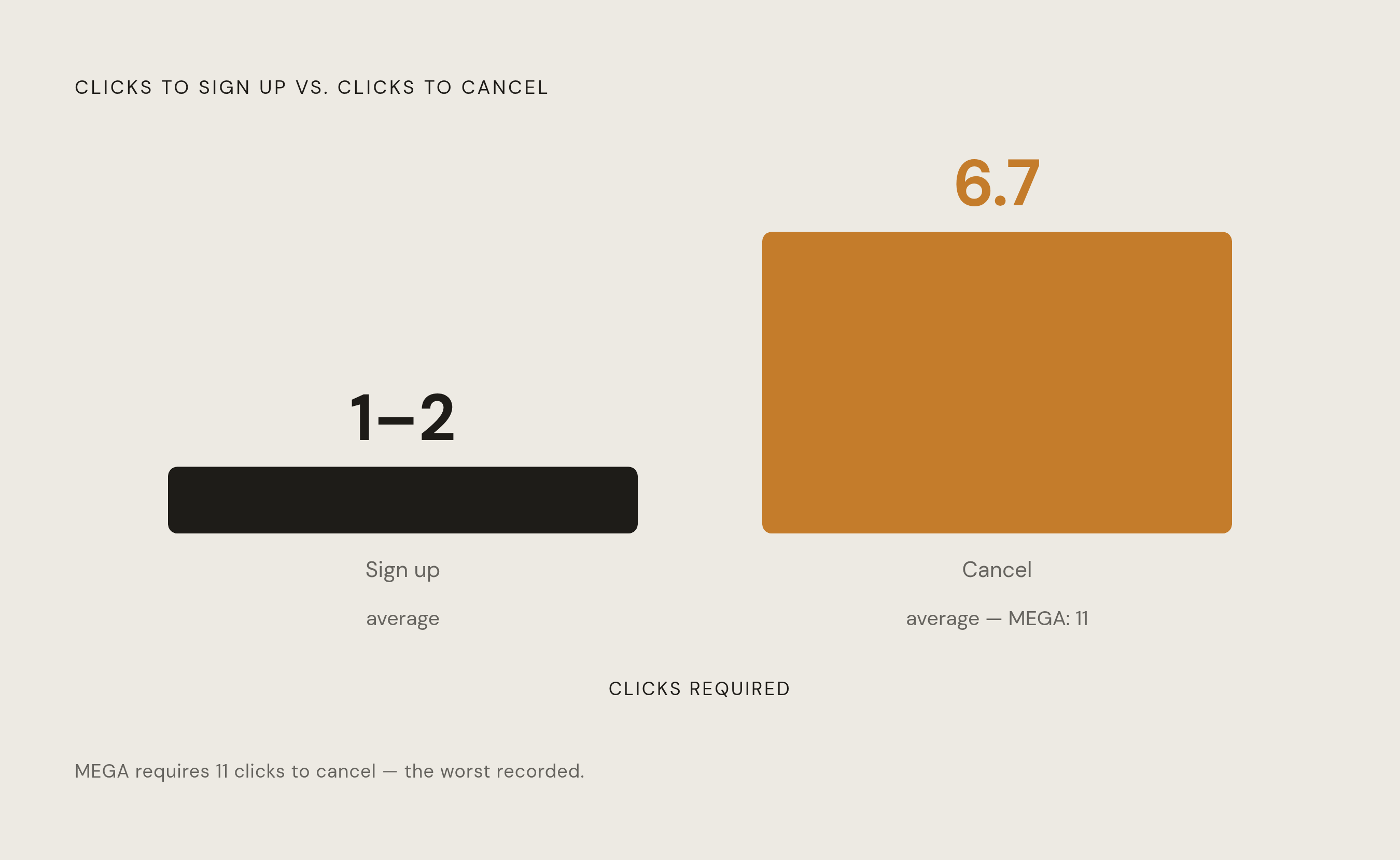
Start with the click count, because it's the cleanest evidence that the imbalance is designed. Independent research found signing up for a subscription takes 1 to 2 clicks on average. Canceling takes 6.7. MEGA topped the list at 11 clicks to get out the door. Nobody accidentally builds a front door with two hinges and a back door with eleven locks.
Layer 1: Navigation burial. The cancel option gets buried under a chain of menus: Account, then Preferences, then Billing, then Manage Plan, then View Options, and finally, Cancel. Sign-up took one click. The path back is built to wear you down, click by click, screen by screen. Some services go further and require a desktop login to cancel, even when the sign-up itself happened on a phone in under a minute.
Layer 2: Channel switching. This is a form of what FTC documentation calls a "roach motel," easy to enter, hard to leave. A service lets you sign up online in seconds, then routes cancellation through a phone line that only answers during business hours. Amazon had an internal name for its version of this maze: the "Iliad Flow." The FTC's Click-to-Cancel rule targeted this pattern directly: if someone signs up online, the rule said, they need to be able to cancel online too. No phone tag, no chatbot loop required just to end billing.
Layer 3: Confirmation loops and confirmshaming. After the first cancel click, a string of "Are you sure?" screens shows up, each one a fresh chance to change course. The button copy itself often does the work: instead of a neutral "Cancel," it's "No thanks, I don't want to save money." These screens aren't informing anyone of anything. They're attrition screens, built to wear down resolve one guilt trip at a time.
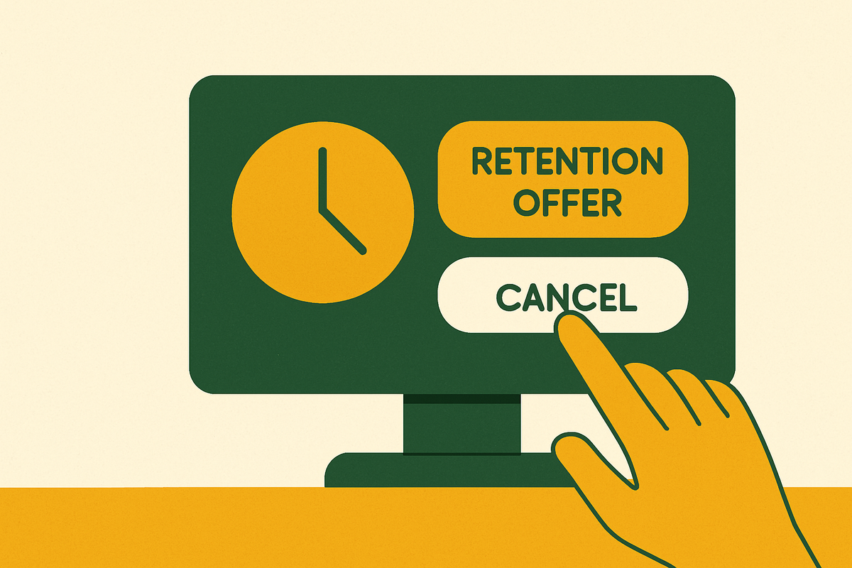
Layer 4: Retention offers dropped mid-flow. A discount or a "pause instead" option appears between the decision to cancel and the final confirmation, timed to hit right when the user is most worn out and most likely to take the path of least resistance. Some flows go further: the "Cancel" button quietly redirects to a lower-tier paid plan instead of ending billing at all. The user walks away thinking they're done. The charges don't stop, they just get smaller.
Layer 5: Silent auto-renewal and trial conversion. A free trial ends with no reminder, and billing starts under a charge name the customer might not even recognize on a statement. The FTC's Negative Option Rule exists specifically to block this: a company can't offer a free trial and slide someone into a paid plan without disclosing that switch clearly, in advance.
An academic scoping review pulled from 28 sources built a taxonomy of 44 distinct dark patterns, sorted into ten thematic groups, and applied that taxonomy across six real-world subscription services for comparison. This amounts to more than a vague impression of a shady industry. It's a catalogued, studied system with named parts.
How the Amazon and Adobe cases expose the system's internal logic
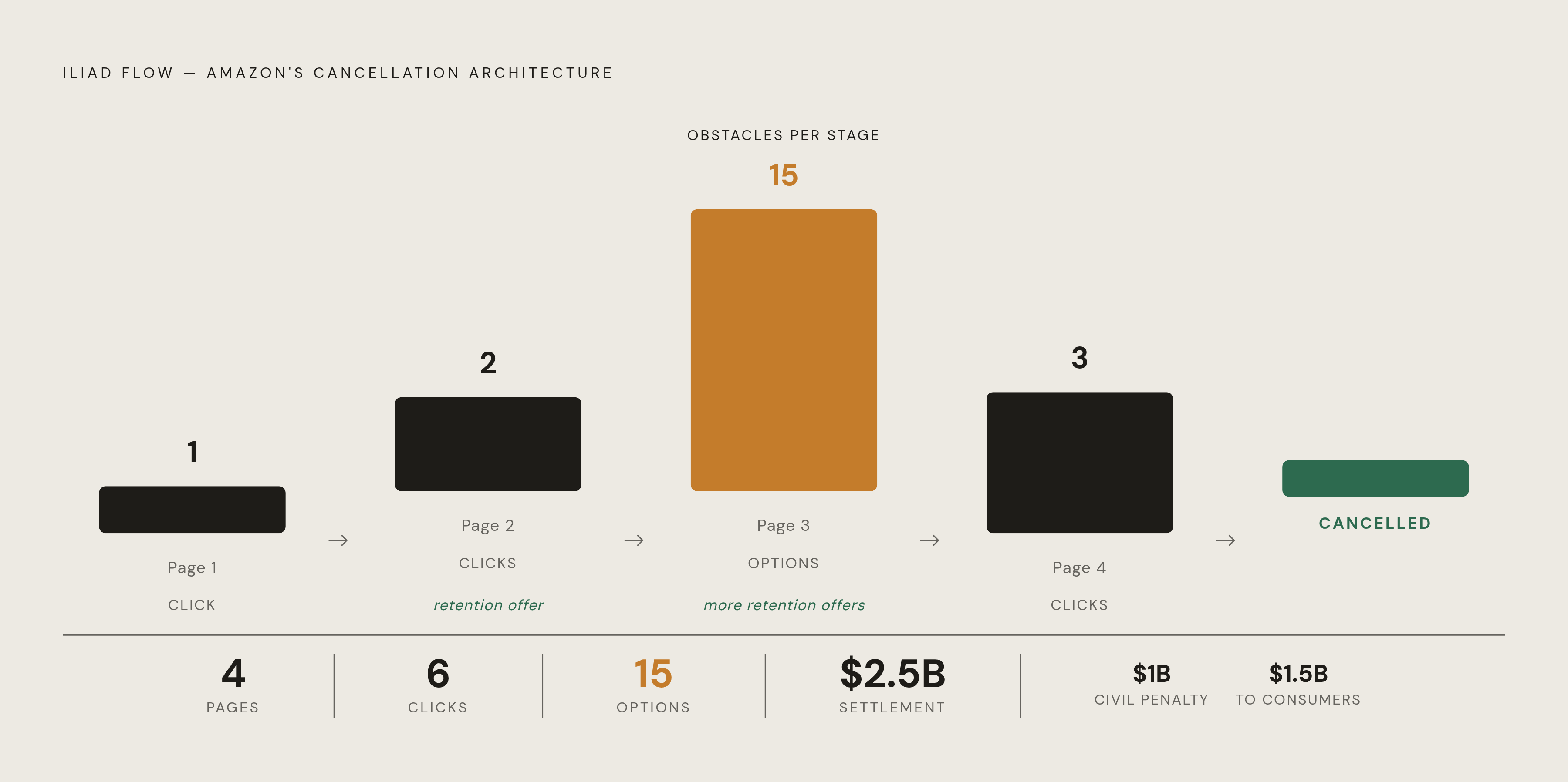
Amazon's "Iliad Flow" is the case that made the internal machinery visible. The name alone says something: an epic poem about a siege that drags on and on, borrowed to describe a cancel button. According to the FTC's complaint, the actual structure ran 4 pages deep, required 6 clicks, and presented 15 different options along the way, with retention offers surfacing along the way. Amazon settled on September 25, 2025, agreeing to pay $2.5 billion, split between a $1 billion civil penalty and $1.5 billion returned to consumers.
Adobe's case adds a layer Amazon's didn't have: a hidden financial trap waiting at the exit. The FTC and DOJ complaint alleged Adobe set "Annual Paid Monthly" as the default plan while burying the fact that customers were locking into a 12-month commitment. Cancel early, and an Early Termination Fee kicked in, up to 50% of whatever was left on the contract, disclosed only behind an easy-to-miss hyperlink. So a customer navigating Adobe's maze wasn't just fighting friction. They were fighting friction with a financial penalty waiting at the far end that they never knew existed. Adobe agreed to pay $150 million on March 13, 2026.
What both cases share matters more than what separates them: the friction was designed on purpose, given an internal name, and maintained as a system, not a leftover from a rushed product launch. And the two cases show the range of what that design can look like. Amazon's flow was pure procedural obstruction, pages and clicks stacked to exhaust patience. Adobe combined that same obstruction with a hidden cost sitting at the exit door.
For anyone trying to size up a cancellation flow, the pattern is: if the company has an internal name for its own process, if retention offers appear at every stage, and if there's a financial consequence for leaving that wasn't disclosed upfront, none of that got there by accident.
What the research shows these friction layers do to users
Start with the payoff, because it's the clearest evidence of harm. Research published in European Association of Cognitive Ergonomics conference proceedings found a 28% drop in user trust and a 54% drop in usability scores among people exposed to dark-pattern-heavy cancellation flows, compared to those given a transparent alternative. Those aren't small effects.
Three mechanisms do most of the damage, according to the academic taxonomy behind that research.
Information asymmetry hides the terms that matter, tucking them onto a second screen or placing them below the button someone's about to click. Visual weighting stacks the deck by rendering one choice in bold, high-contrast color at full size while the other sits off to the side in grey text, technically present, functionally invisible. Effort asymmetry just makes leaving cost more than staying, structurally, on purpose.
The European Commission ran a behavioral study across the EU and found that 97% of the most popular websites and apps used by consumers there deployed at least one dark pattern. Under that exposure, choices inconsistent with what a person actually said they wanted rose to 47% for average consumers and 51% for vulnerable consumers. That four-point gap says something on its own: whatever these patterns are built to exploit, it hits harder for people with less room to push back.
The guilt-trip variant of this deserves its own mention because it works differently. "Your data will be deleted." "Your family members will lose access." These read like warnings. They function as emotional friction, built to exploit loss aversion rather than confusion.
So when a cancellation flow leaves someone feeling uncertain, guilty, or just tired of clicking, that reaction stems from deliberate design choices. Those feelings were built into the flow on purpose. And recognizing which lever is being pulled, information buried out of sight, effort stacked artificially high, or guilt dressed up as a warning, is the first real step toward getting through the flow instead of getting stopped by it.
How regulators have tried to dismantle these flows, and where things stand now
The FTC's answer to all this was the Click-to-Cancel rule: proposed in 2023, finalized in October 2024. Its core requirement was simple to state, if not simple to build: canceling had to be as easy as signing up. That meant clear disclosures, informed consent given separately (not buried in a Terms of Use page nobody reads), and one-click cancellation for anything bought online.
In concrete terms, the rule required an online cancellation path anywhere sign-up happened online, no routing customers to a phone line as the only exit. It required consent to be obtained clearly and separately, not buried in other disclosures. It required companies to disclose how cancellation works before the first charge ever hits a card. And it required companies to keep documentation of that consent.
Then, in July 2025, the U.S. Court of Appeals for the Eighth Circuit vacated the rule entirely, ruling that the FTC had skipped a required preliminary regulatory analysis under Section 22 of the FTC Act. The new FTC leadership hasn't appealed that decision. There's movement again, though: on January 30, 2026, the FTC submitted a draft Advance Notice of Proposed Rulemaking to OIRA, restarting the process from closer to square one.
None of that means companies have a free pass. The FTC still enforces Section 5 of the FTC Act and ROSCA against manipulative cancellation practices, and the Amazon and Adobe settlements prove the point: billions of dollars in liability, without needing the vacated rule at all.
Below the federal level, protection still varies by state. California's Automatic Renewal Law requires clear disclosure and an easy way out. New York has enacted consumer protections against deceptive subscription practices. Illinois has laws requiring notice before automatic contract renewals take effect. Virginia has consumer protection law that reaches deceptive subscription practices.
None of this has slowed the behavior down much yet. A 2024 sweep by ICPEN across 27 countries examined 642 subscription platforms and found 75.7% used at least one dark pattern, with 66.8% using two or more. Enforcement exists. Prevalence hasn't budged to match it.
So the practical picture: federal rule protection is gone for the moment, state protection depends entirely on where someone lives, and the risk companies face is real but applied unevenly. Nobody should assume the system will catch a bad flow in time to help them personally.
How to read a cancellation flow before it reads you
Treat this as pattern recognition, not a fight. Every move in a cancellation flow is a known move. Naming it as it happens takes most of its power away.
Before starting, take a screenshot of the current billing settings and the exact charge amount. That matters because some "cancelled" flows quietly enroll a customer in a cheaper tier instead of ending billing, and the screenshot is the only proof of what changed.
Hitting a multi-step menu, the cancel option is almost always sitting under Billing or Account Management, not the main navigation bar. Go there directly and skip everything else.
Offered a discount or a pause option, note it and move past it unless it's genuinely wanted. That screen exists to restart the decision-making process from scratch, not to help.
Confirmshaming shows up, read the button text literally and ignore the guilt trip built into the wording. "No thanks, I don't want to save money" means cancel. Click the secondary, unhighlighted option, not the one lit up in color.
Redirected to a phone number, and living in California or New York, the law likely requires an online path to exist somewhere in that flow if sign-up happened online. Look for it before picking up the phone.
After finishing the flow, confirm billing actually stopped. Check for a confirmation email, and watch the next billing date closely. The redirect-to-lower-tier trick means completing a flow and actually canceling aren't always the same thing.
Here's the real problem with all of this: even someone who knows every one of these tricks has to run this checklist again, every time, for every subscription, on the company's schedule, not their own. The knowledge is necessary. Doing it manually, forever, isn't sustainable for anyone with more than a handful of subscriptions running at once.
That's the gap tools built for continuous account monitoring are meant to close: watching for charges that show up after a cancellation should have ended them, flagging free trials before they quietly convert, catching duplicate or creeping charges before they pile up. Tools built for this purpose monitorconnected accounts in read-only mode and surfaces each finding with a specific dollar amount and a clear next step, so a subscription that was supposedly cancelled but started billing again doesn't sit unnoticed until the next time someone happens to check a statement line by line.
The read-only setup is what makes this work. Monitoring is only as useful as what it can actually see, and connecting accounts broadly, in read-only mode, is what makes it possible to catch a charge sitting under an unfamiliar billing name, or notice that something marked "cancelled" two months ago just billed again anyway.
Sources
- Dark patterns in subscription service cancellation processes | Proceedings of the 36th Annual Conference of the European Association of Cognitive Ergonomics
- Companies Are Designing Subscriptions You Can’t Cancel — The FTC Is Finally Fighting Back | by dave | Medium
- Explaining dark pattern
- researchgate.net
- icpen.org