Loss Aversion in Subscription Cancellation Flows
Subscription companies exploit loss aversion to make canceling harder than signing up.
Roughly 80% of U.S. adults paid for at least one subscription between April 2024 and April 2025, spending an average of $1,080 a year, according to a YouGov/CNET survey. Signing up for any one of those subscriptions took a single click and maybe ten seconds. Canceling almost never does, and that gap between how easy it is to start paying and how hard it is to stop isn't an accident of bad design. Rather, it's the result of good design, aimed at the wrong goal: keeping you subscribed by exploiting a well-documented psychological bias called loss aversion.
What loss aversion actually means, and why subscriptions are the perfect target for it
Loss aversion is the tendency to feel the sting of losing something far more sharply than the pleasure of gaining something equal in value. Tell someone they'll save $10 and they shrug. Tell them they'll lose $10 and they pay attention. Framing matters more than substance, and subscription companies know this cold.
Subscriptions are especially fertile ground for the bias, for a few overlapping reasons. Users build up history inside these services: playlists, saved episodes, course progress, custom settings. None of it might get used again, but it feels owned, and the endowment effect kicks in, meaning things feel more valuable simply because they're "yours." Layer on the sunk cost fallacy (a customer already paid for six months, so should get something out of it) and status quo bias (staying subscribed takes zero effort, canceling takes several), and the result is a psychological environment practically built for a company to exploit.
Survey research on subscription behavior backs this up directly. Roughly half of respondents in one analysis admitted they hesitate to cancel specifically because they're afraid of losing progress or saved features, things like playlists or course dashboards. People agreed strongly with statements like "I hesitate to cancel because I might need it again," and that statement alone is loss aversion in one sentence.
This is the raw psychological material every human brain carries around, the terrain on which more deliberate tactics get built.
The specific tactics cancellation flows use to trigger loss aversion
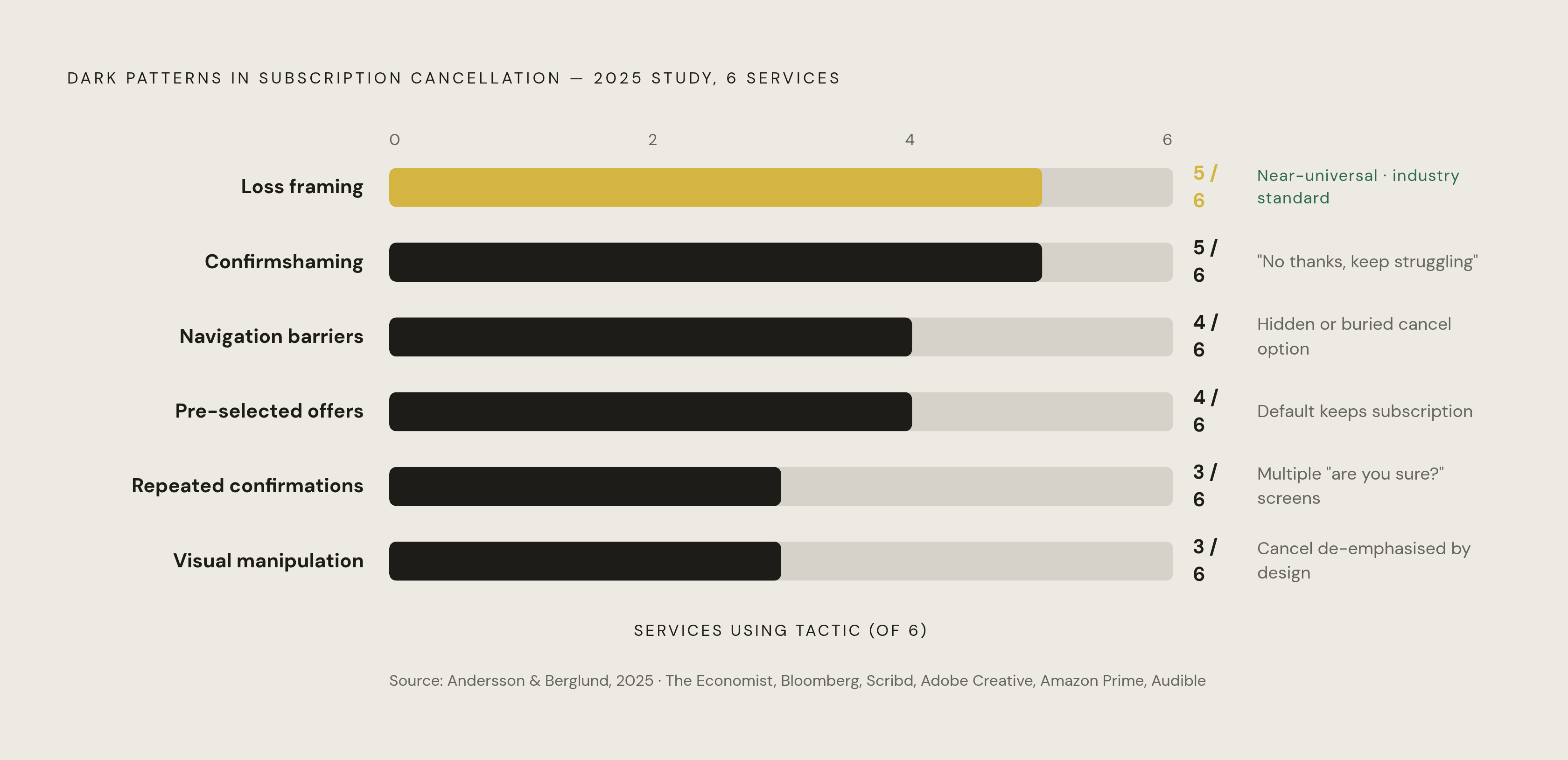
A 2025 study examining six major subscription services, including The Economist, Bloomberg, Scribd, Adobe Creative, Amazon Prime, and Audible, found loss aversion manipulation in five of the six. It was the single most common dark pattern in the entire study. Emotional exploitation and hidden cancellation options showed up in four of the six, meaning this isn't a rare bad actor; it's close to standard practice.
The tactics break down into a handful of recognizable moves.
Loss-framing screens present cancellation as forfeiting something you already have, framing it around what disappears rather than what simply stops. A list of features, saved content, or credits pops up right when you try to leave, worded specifically to maximize how much you feel you're about to lose.
Confirmshaming forces you to click a button that insults your own choice to proceed, something like "No thanks, I don't want to save money." It's not subtle, and it works because it drags your self-image into a decision that should be purely financial.
Navigation barriers bury the cancel button three menus deep, or require a live chat, or route you to a phone call with a retention agent. Every extra step is another chance for loss aversion to talk you out of it.
Pre-selected retention offers show up with the "stay" option already checked, so you have to actively opt out of a discount or pause just to keep going. That's status quo bias doing the heavy lifting alongside the fear of loss.
Repeated confirmation screens ask "are you sure?" two, three, four times, each one re-presenting the same loss-framed warning, designed less to confirm your choice than to wear you down until you give up trying.
Visual manipulation rounds it out: the cancel button rendered as a pale, low-contrast ghost link, while "Stay Subscribed" gets the bold color and the big rectangle. Nobody has to say which option is "correct." The hierarchy says it for them.
These tactics get embedded into ordinary-looking screens, often below a user's conscious notice, and they work best precisely when someone is tired, distracted, or in a hurry.
Amazon's "Iliad" flow as a case study in engineered exits
Amazon's own internal name for its Prime cancellation process was "Iliad," a nod to the ancient Greek epic, chosen because the flow was long and complicated by design. That name is itself a piece of evidence about intent.
The FTC alleged the process required multiple pages and multiple confirmation steps, with retention offers and benefit-loss warnings interrupting the user at several points along the way. What makes the case worth studying is that the name confirms the length was the point rather than an accident of clunky engineering. Loss-framing and navigation barriers weren't isolated glitches here; they were stacked on top of each other, deployed across one of the largest subscription bases on Earth.
Amazon settled with the FTC in September 2025 for $2.5 billion: $1 billion in penalties, $1.5 billion returned to consumers. That figure suggests regulators concluded the design caused real, measurable harm at scale; settlements of that size are reserved for exactly this kind of finding.
The settlement doesn't set a binding standard for anyone else. Amazon had to fix its own flow, but the broader playbook, the loss-framing, the confirmshaming, the pre-checked boxes, remains legal everywhere else it's already been built.
Why the regulatory backstop consumers expected isn't there yet
The FTC finalized its "Click-to-Cancel" rule in October 2024, built on three pillars: cancellation had to be as easy as sign-up, consent had to be explicit, and terms had to be disclosed clearly. It looked, for a moment, like the loophole was closing.
Then in July 2025, the Eighth Circuit Court of Appeals vacated the entire rule on procedural grounds. The FTC had skipped a required preliminary economic analysis after the rule's projected impact crossed $100 million. One missing filing, and the whole rule disappeared.
Now the rule is gone, yet the practices it targeted are still here.
Europe's answer, the Digital Fairness Act, takes aim at dark patterns and auto-renewals directly, but the formal proposal isn't expected until late 2026, and mandatory application won't arrive before 2029 at the earliest. That leaves a gap measured in years, not months.
No enforceable U.S. standard currently requires easy cancellation. Companies that built friction into their flows face no legal obligation to remove it. The Amazon case proves litigation is possible after the fact, but it took years, consumed FTC resources, and only refunded a portion of the people affected. For everyone else, right now, canceling is a solo project.
What legitimate retention looks like — and how to tell the difference
Some obstacles in a cancellation flow are real offers a person might genuinely want, and it's worth telling those apart from the traps before assuming every retention screen is hostile.
Pausing is the clearest example of a legitimate lever. Recurly's data shows 25% of would-be cancellers choose to pause instead, when given the option cleanly. Chargebee's 2025 consumer research found 58% of people actually prefer pausing to canceling outright, especially when the reason is temporary, a tight month, a vacation, a short break rather than a permanent breakup with the service. Paused subscriptions grew 68% year over year in 2024, and companies recovered real revenue from people who came back later. Everybody wins in that version of the story.
The test for whether an offer is legitimate or manipulative comes down to presentation. A clearly labeled pause button with honest terms, no pre-check, no loss-framing wrapped around it, counts as a real choice. The same pause option pre-selected and surrounded by "you'll lose all your saved data" copy is manipulation wearing a nicer outfit. Discounts follow the same logic: stated plainly, they're fine, but buried behind three loss-framed screens meant to wear someone down before the discount even appears, they raise real concern.
Taking a real pause or a real discount isn't a failure of willpower. The point of understanding these tactics is to cancel with clear eyes; and clear eyes sometimes land on "actually, pausing makes sense here."
How to cancel without letting the flow decide for you
Loss aversion loses most of its power the moment you see it coming. It thrives on time pressure and uncertainty, so removing both ahead of time changes the entire interaction.
Before starting the cancellation, decide in advance whether a pause or discount would actually change your mind, and at what price. Write down, even just mentally, the reason for canceling. That reason becomes an anchor the flow can't easily talk you out of.
Once inside the flow, treat loss-framing screens as a feature list, weighing plainly whether any of it gets used, rather than as a warning to react to. Recognize confirmshaming for what it is and click through anyway; the guilt it produces is manufactured, not earned. Check retention offers for pre-selected boxes before hitting continue. If the flow suddenly demands a phone call or live chat, understand that the person on the other end has a retention quota, not a customer-service mandate.
Nearly 30% of annual subscriptions get canceled within the first month, which tells you something important: most people who start the cancellation process have already made up their mind. The flow's entire job is making them doubt a decision they'd already settled.
After hitting cancel, don't assume it worked. Instead, check the next billing cycle on a bank statement. That's the only confirmation that actually counts.
Why the subscriptions you've already canceled may still be draining money
Some cancellation attempts simply don't finish. The friction built into the flow causes a step to fail silently, the user believes it's done, and the charge keeps coming anyway. Free trials work in a similar but quieter way: no loss-framing screen required, because the default setting is "charge the card," and the trial clock just runs out unnoticed.
32% of consumers say subscriptions now eat up more than half their discretionary spending. Multiply a few forgotten subscriptions across months, sometimes years, and the number stops looking small.
The real problem is structural: tracking every active subscription, every trial about to convert, every charge that continued despite a cancellation attempt, requires ongoing attention that a one-time manual check can't provide. Nobody sits down quarterly and audits every line on a bank statement against every service they've ever signed up for.
This is the gap Compass+ is built to close. It is designed to surface the subscriptions still charging after a cancellation, trials about to flip into paid plans, and duplicate charges, bringing each one to the user's attention rather than waiting for someone to go looking for it.
Understanding how a cancellation flow tries to exploit loss aversion is the first layer of defense. Having something still watching the charges after the fact, quietly, in the background, is the second.