Free Trial Pricing Psychology and Conversion Design
Requiring a credit card at signup nearly triples trial-to-paid conversion.

Free trial pricing is a psychological architecture, tuned against millions of user records to move someone from free to paid before they consciously decide to buy anything. The word "free" is doing a lot of work to hide that.
The single highest-leverage decision in trial design is whether a card is required at signup. Not trial length. Not feature access. The card, full stop.
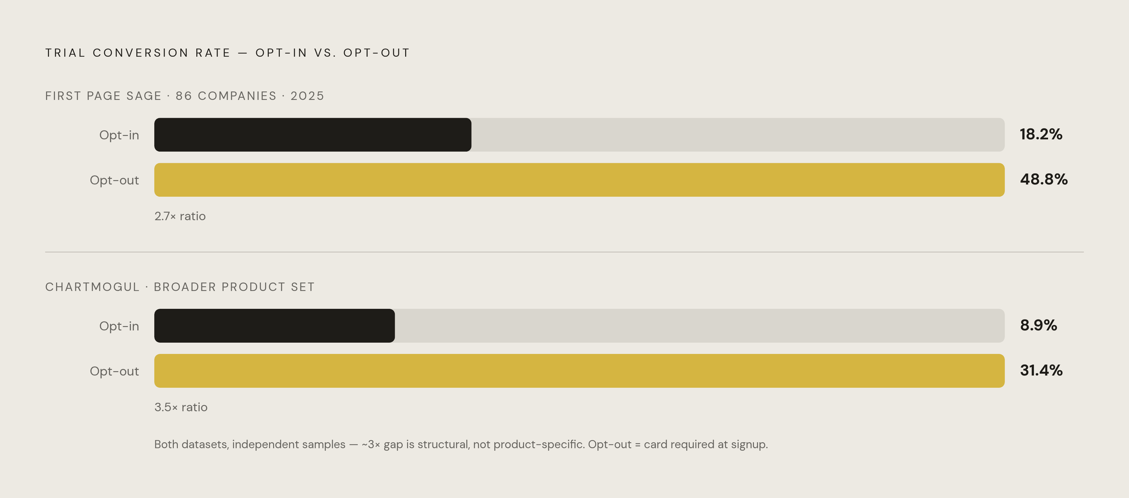
A 2025 study from First Page Sage, covering 86 companies, found opt-in trials (no card required) converted at 18.2%. Opt-out trials, the kind that collect payment details up front, converted at 48.8%: almost three times higher. A separate ChartMogul dataset spanning a larger set of products found the same threefold gap at different absolute numbers, 8.9% versus 31.4%. Two datasets, years apart, landing on the same ratio. That points to a mechanism, not a coincidence.
The gap traces to inertia more than product quality or how badly someone wants the thing. Canceling takes action. Getting charged takes nothing at all. Once a card sits on file, the default outcome is a subscription, and stopping it means the user has to remember, on a schedule they never chose, to go do something about it.
The card field flips the default. Before it's entered, nothing happens unless the user acts. After, something happens unless the user acts. That's the whole trick, and it runs the same whether or not anyone building the signup form ever admits it out loud.
Here's the tell worth remembering: any trial asking for payment info before you've touched the product is opt-out, no matter what the button says. "Start your free trial" and "no obligation" mean nothing once the card number's already stored.
How trial length is chosen to plant commitment rather than to give users time
The intuitive read goes like this: longer trials give people more time to decide, shorter trials rush them. That read is badly incomplete on both counts.
Recurly's data shows 7-day-or-shorter trials posting the highest conversion rate in the set: 78.6%. Nearly all of those are opt-out, card-required trials in consumer categories. Shorter trials create pressure more than room to think.
A two-year randomized field experiment across hundreds of thousands of users in 190 countries tested 7-day trials head-to-head against 3-day trials. The longer trial lifted sign-ups by 11%, since more people will commit to something with more runway attached. But it moved immediate conversion barely at all. Whoever was going to convert converted, whether they had 3 days or 7.
What the longer trial actually changed was something else: a 42% jump in delayed reactivation, people who tried the product, didn't buy right away, and came back weeks later. That's a re-engagement number more than an evaluation number. Some trial lengths get chosen to feed a follow-up campaign months out, not to give anyone breathing room.
Most free-to-paid decisions land in the first 72 hours, not near the deadline, and that's the detail that matters most if you're inside a trial right now. In many B2B contexts, conversion drops sharply after the first two weeks. Companies know this window cold, and they time upgrade prompts to hit it directly. The number printed on the trial banner tells you far less than you'd guess, because the real pressure is loaded at the front, not the back.
The psychological tactics embedded in the trial experience itself
Three mechanisms show up again and again inside trial flows, each one with a name in behavioral research.
Loss aversion messaging frames the trial's end around what disappears, rarely around what you'd gain by paying. "Your projects auto-archive after trial." "Your data will be deleted." Countdown timers make the loss feel close no matter how many days remain, and "spots filling up" banners trigger the same fear with no real scarcity behind them.
Value anchoring puts a pricier tier next to the plan you're actually being pushed toward, so the target price looks modest by comparison. You end up comparing two plans against each other instead of asking whether you need either.
Commitment bias gets built early, through onboarding. Set your preferences, upload your data, invite three colleagues, and by the time the payment prompt appears, you've already got something to lose. Annual discounts stack on top of this: a year-long financial commitment gets reframed as a savings decision, which feels lighter than what it is, even though the dollar figure is larger.
Recurly's research also found that surfacing a new feature during the trial converts better than cutting the price. So companies time feature reveals to land exactly when the upgrade ask does. That escalation makes sense against the broader trend: Recurly's 2025 report shows overall trial conversion falling from 46% to 33% year over year. Consumers are getting more resistant. Companies are answering with more pressure.
What dark patterns look like when cancellation is the design problem
If the trial is the front door, the cancellation flow is the locked exit, and plenty of exits get locked on purpose.
ICPEN's 2024 review of 642 websites and apps across 26 countries found nearly 76% used at least one dark pattern, and nearly 67% used more than one. Research tracking people who subscribed and then canceled catalogued the recurring tactics: loss aversion warnings dropped right at the confirmation step, guilt language meant to make you second-guess the click, retention offers hiding the actual cancel button, and navigation barriers like multi-page flows, forced phone calls, or chatbots planted between the user and the exit.
Amazon's Prime cancellation flow is the clearest documented case on record. Internally, Amazon reportedly named it "Iliad," a nod to its own length and difficulty. The FTC alleged the flow used multiple pages, repeated retention offers, and coercive design specifically to block completion. In 2025, Amazon agreed to a $2.5 billion settlement and now has to disclose terms clearly before collecting billing information, with the manipulative steps stripped out.
Regulators apply one blunt test now: is canceling harder than subscribing? When the answer is yes, that asymmetry reflects a choice somebody made, not a technical limitation anyone stumbled into.
How regulation is trying to catch up to conversion design
The FTC's Click-to-Cancel rule, finalized in late 2024 and moving into enforcement through 2025 and 2026, sets a direct standard: canceling has to be as easy as signing up. Concretely, a company can't require a phone call, a chatbot, or a multi-step process to cancel if signup took one click.
Europe's Digital Services Act, fully in force since February 2024, bans dark patterns outright on online platforms, with the strictest duties falling on Very Large Online Platforms. Further out, the EU's Digital Fairness Act is expected to be formally proposed in late 2026, aimed squarely at subscription auto-renewals and addictive design, though mandatory application isn't due before 2029.
That leaves a real gap, and it's worth naming plainly: companies get years of operating room under current rules before 2029 arrives, and enforcement of what's already on the books varies widely by country and regulator. Protection exists on paper. Whether it gets applied in any specific case is a separate question, which is exactly why the rules are worth knowing. Recognizing a violation is what lets someone escalate it, rather than assume a locked exit is just how the internet works.
The subscriptions that survive a trial often go unnoticed for months afterward
Sit with Recurly's numbers for a second: conversion fell from 46% to 33% year over year, even as more trials than ever get started. More people are signing up. Fewer are consciously choosing to stay.
That gap, between "I signed up" and "I'm actually using this," is where money quietly leaks. An opt-out trial that converts becomes a recurring charge, and plenty of people don't notice until it's hit their account two or three times. Annual plans are the hardest to catch of all, since the next charge sits 12 months out. By the time it lands, most people have forgotten the trial ever happened.
Layer a quiet price increase on top of that, one arriving well after the initial conversion, and the problem compounds. The original signup happened at a low-attention moment; the price hike gets even less scrutiny than that did. Multiply this across the streaming, software, and service subscriptions a typical household runs at once, and manual tracking stops being realistic. Too many billing cycles are moving at once for anyone to hold them all in their head.
Money committed during a distracted five minutes at signup keeps leaving the account indefinitely, long past any point where a real, conscious choice got made to keep paying.
Why recognizing these mechanics in real time requires something watching all the time
Every mechanism covered here, opt-out defaults, the 72-hour pressure window, annual commitment bias, buried cancellation flows, exploits the same blind spot: the user isn't watching closely enough at the exact moment it counts. That gap comes down to math more than character. Nobody tracks twelve billing cycles with the same attention a company pays to its own conversion funnel.
A one-time audit fixes the past. It's useful for showing what's currently draining an account, but it won't catch the trial that converts tomorrow or the price that quietly rose last cycle. Continuous monitoring covers that remaining ground: catching free trials before the charge posts, flagging price changes against what was originally agreed to, surfacing duplicate charges or a trial someone forgot they started, and calling out subscriptions that survived the trial window on inertia alone.
Compass+ is built around exactly that gap. It connects to bank accounts, email, and subscription services in read-only mode, watches continuously without needing anything further from the user after setup, and surfaces findings with a specific dollar figure and a clear next step. The read-only part is the design choice that actually matters: monitoring worth trusting here has to see everything and touch nothing, no ability to move money, just the ability to flag when money is about to move on its own.
A spending dashboard tells you what already left the account. Knowing what's about to be charged, with enough runway to still do something before that window shuts, matters more.