Hidden Subscription Enrollment in Retail Checkout
Companies use hidden enrollment tricks at checkout to lock customers into recurring subscriptions.
Retail checkout used to mean one thing: you picked something, you paid for it, done. Now it's often the moment a company quietly starts billing you every month, using design tricks specific enough to have names and a growing enforcement record behind them. That's the actual subject here: not whether subscriptions are good or bad, but how checkout screens get engineered to enroll people who never meant to sign up for anything recurring.
Subscriptions make sense for a business. Predictable revenue, every month, without needing to resell the same customer every time. Checkout is the cheapest possible moment to lock someone into that arrangement, because the card is already out and the person is already mid-decision. That shift from "complete this purchase" to "start this relationship" didn't happen by accident. Research out of Yale's Journal on Regulation, from the Fletcher team, points to a specific business logic behind it: set-and-forget defaults paired with cancellation processes built to be a pain, because companies know a good share of customers will underestimate what the service will cost them a year from now, or just never get around to canceling. And the money backs this up. Annual consumer subscription spending in the U.S. climbed from $237 in 2018 to $273 in 2021, according to figures cited in theregreview.org. That's not organic demand. That's a model working exactly as designed.
How widespread hidden enrollment actually is
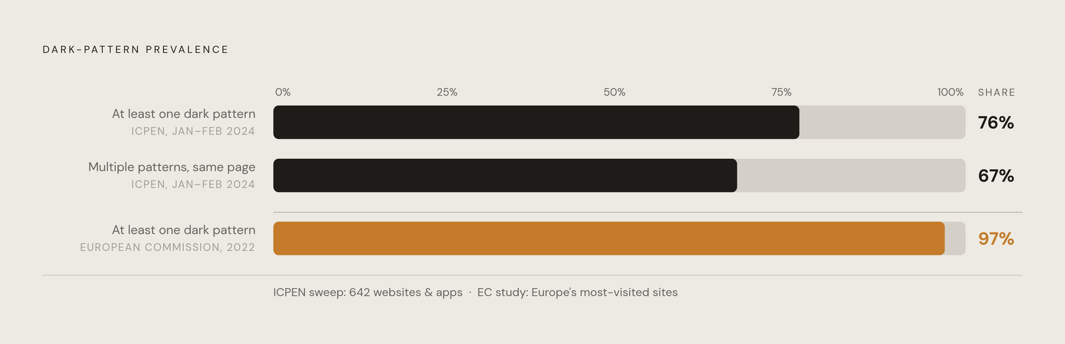
This isn't a handful of shady sites. It's close to the norm.
A sweep run by the International Consumer Protection and Enforcement Network, covering January 29 through February 2, 2024, looked at 642 websites and apps selling subscriptions across 27 authorities in 26 countries. Nearly 76% of what they checked used at least one likely dark pattern. Nearly 67% stacked multiple ones on the same page.
Europe's numbers are worse. A 2022 European Commission assessment found that 97% of the continent's most popular websites employed at least one dark pattern. France's consumer protection agency, the DGCCRF, puts the cost of hidden subscriptions, stealth fees, and manipulated impulse buys at €8 billion in losses across Europe, and the agency itself calls that figure the tip of the iceberg, given how little consumers understand about what's happening to them. Marie Potel-Saville, co-founder of FairPatterns,, put a number on that blind spot in Fashion Network's reporting: 87% of people don't even realize they're being manipulated when it happens.
And this isn't fringe operators running janky checkout flows. Enforcement actions have named Amazon, Adobe, Care.com, and JustAnswer, companies with design teams that are about as sophisticated as it gets. Scale like this doesn't happen because a few product managers got sloppy. It happens because specific, repeatable tactics work, and they get reused across the industry once someone proves they convert.
The specific mechanics retailers use to obscure enrollment at checkout
Here's what those tactics actually look like, mechanic by mechanic.
Hidden subscription. The foundational pattern, per Deceptive.design's taxonomy of these tricks. The customer believes they're buying something once. Somewhere in fine print, or in a legal disclosure that never actually surfaces in the interface, there's a recurring billing term nobody was shown clearly.
Pre-ticked boxes. An add-on or subscription checkbox arrives already checked. The customer has to notice it and actively uncheck it, which is easy to miss when you're moving fast and focused on finishing the order. The EU's Digital Services Act broadly addresses manipulative interface design on online platforms, and pre-checked boxes have been targeted under related EU consumer protection rules.
Ambiguous button labels. The button says "Get your order" or "Continue." It doesn't say "Start your $14.99/month subscription." The Amazon Prime enrollment flow is the case study everyone points to: buttons folded into a normal-looking checkout, with language vague enough that internal testing reportedly showed customers enrolling by accident, according to FTC complaint details cited in The Regulatory Review. Leadership resisted simplifying it.
Drip pricing. The real cost and the recurring terms show up only after the customer has mentally committed, sometimes after card details are already typed in. By then, most people finish rather than back out.
Forced continuity. A free trial converts to paid with no real notice. Deceptive.design's Figma example is a clean illustration: inviting a collaborator with "can edit" permissions quietly opens a new monthly charge on the inviting user's card, with nothing in the interface flagging that a subscription just started.
Fake urgency. Countdown timers, "only two left" warnings tailored to look personal, offers that expire in minutes. Regulators have flagged this kind of manufactured pressure because it is specifically built to shortcut scrutiny.
Visual hierarchy tricks. The "subscribe" button is big and bright. The "no thanks" option is small, gray, buried at the bottom, sometimes phrased to sound like you're rejecting a discount rather than declining a subscription.
Subscription slipped into cart. A recurring item gets added next to the one-time purchase, quietly, as a separate line. Unless someone reads every line of the cart, it's invisible.
Post-enrollment silence. Once someone's signed up, no reminder emails, no billing notices, nothing that would jog memory. This is arguably the mechanic that makes everything else durable: the deception doesn't end at signup, it continues as an absence, a deliberate lack of any signal that would make someone stop and check.
Hard-to-cancel design almost always rides alongside hidden enrollment. The friction on the way out is built to match the invisibility on the way in.
Why these tactics work on nearly everyone, not just inattentive shoppers
These patterns exploit specific, well-understood features of how people think, not carelessness. A Finance Watch explainer on dark patterns describes the mechanism: manufactured urgency, fear of missing out, time pressure that shuts down deliberate thinking before it starts.
Checkout itself is a bad moment for scrutiny. The customer's attention is locked on finishing the transaction, not auditing every checkbox and button label on the page, and designers know exactly where that attention goes and doesn't go. The set-and-forget default plays on optimism bias too: people consistently underestimate how much they'll actually use something, and how a small monthly charge adds up over two or three years of not canceling.
That 87% figure from Potel-Saville deserves a second look here. It isn't a measure of how gullible people are. It's a measure of how precisely these tactics are calibrated to normal human attention, which is a very different and more alarming thing.
Certain groups carry more risk: seniors dealing with dense interfaces and small print, people with less digital fluency, anyone making decisions under financial stress who needs to move fast, and children or teens who respond strongly to gamified prompts and social proof, per Finance Watch's breakdown. But nobody gets a pass just for being careful or tech-savvy. These flows are built by teams whose entire job is finding the gap in attention that any given user has, and exploiting it.
What regulators have done, and what the enforcement record actually shows
The record is real, but it's mixed, and it says as much about the limits of enforcement as it does about the wins.
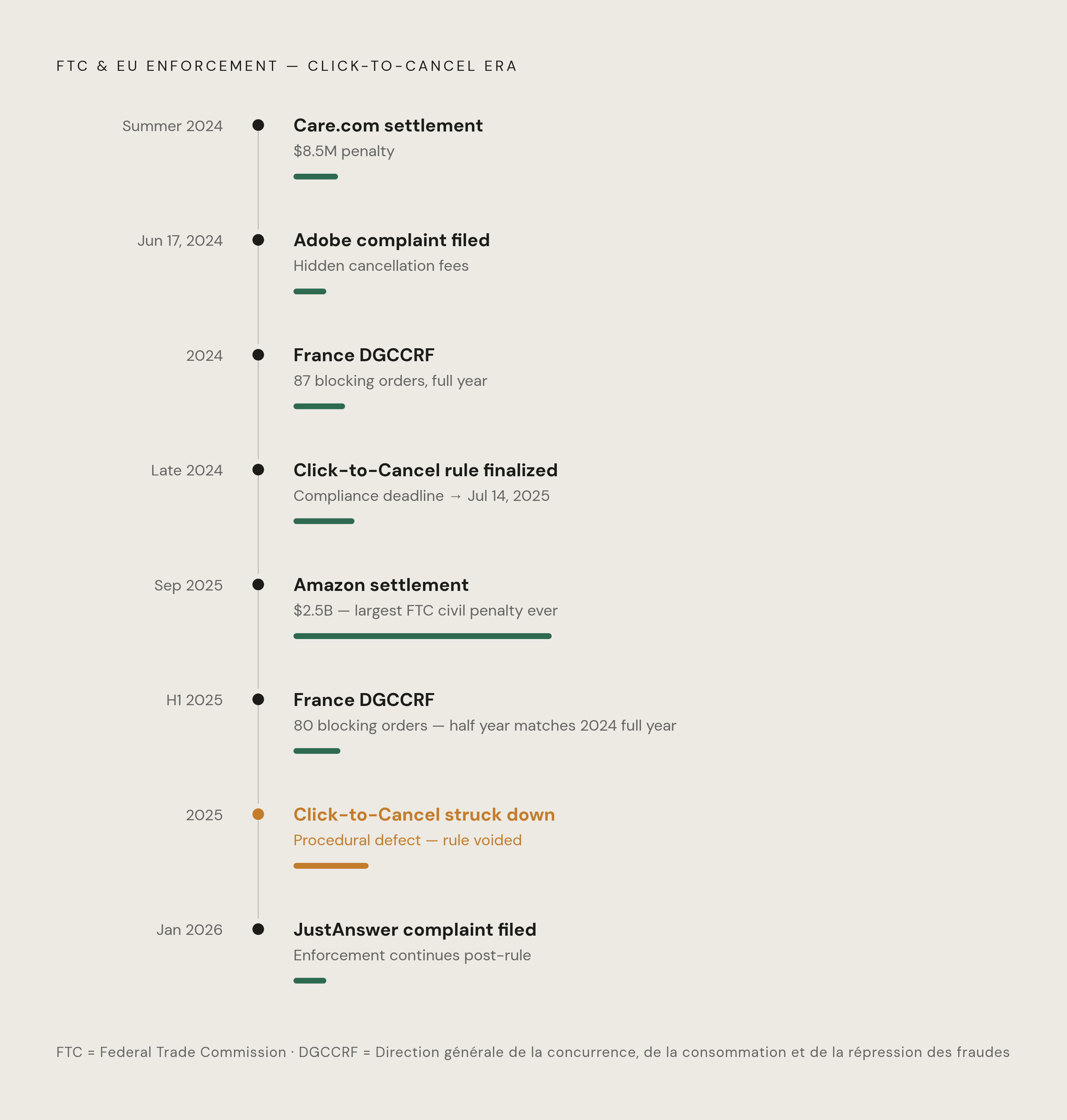
The FTC's biggest swing landed in September 2025: a $2.5 billion settlement with Amazon, the largest civil penalty ever tied to an FTC rule violation. Roughly $1 billion of that was civil penalties, $1.5 billion in refunds to customers. Amazon now has to clearly disclose subscription terms and costs before it takes billing information, and the settlement required real changes to how enrollment and cancellation actually work in the interface.
Care.com settled for $8.5 million in the summer of 2024. The FTC's complaint said the platform systematically deceived caregivers while denying families a simple way to cancel, and the agency used the phrase "sometimes referred to as dark patterns" to describe what Care.com was doing with cancellation. Adobe faced a complaint on June 17, 2024, alleging violations of the FTC Act and ROSCA for tricking customers into subscription plans without proper disclosure, paired with a needlessly complicated cancellation path. JustAnswer followed in January 2026, accused of leading consumers to believe they were paying a small one-time fee when they were actually being enrolled in a recurring monthly charge with no real consent given.
The FTC also tried to fix the structural problem directly with its Click-to-Cancel rule, finalized in late 2024. Cancellation had to be as easy as signing up, through the same channel. Companies got one save-attempt offer, max. Phone-only cancellation got banned for anything a customer could join online. Original deadline was May 14, 2025, pushed to July 14, 2025.
Then a federal appellate court struck the rule down in 2025, ruling that the FTC had failed to complete a required preliminary regulatory step before issuing it. So the rule with the most teeth against this exact problem is gone, not because regulators were wrong about the harm, but on a procedural technicality.
Europe's approach leans on the Digital Services Act, which addresses dark patterns on platforms. A Digital Fairness Act is in the works, with negotiations expected to run through 2026 and 2027, and any resulting law probably not taking effect before 2028. France's DGCCRF has made dark patterns a named enforcement priority for 2025 through 2028: 80 e-commerce sites got hit with digital blocking orders in just the first half of 2025, up from 87 total orders across all of 2024, even as the number of active sites in France grew 8% to 165,000 in 2025.
FEVAD, the French e-commerce trade group, argues 80% of these deceptive practices are already illegal under existing law. The real gap is enforcement capacity, not missing legislation. Potel-Saville's critique cuts the other way: fines that barely dent a major platform's budget don't function as real consequences, and while automated detection of these patterns is technically possible, regulators still lean heavily on manual review. Worth noting that dark-pattern enforcement isn't confined to consumer protection law either: the Irish Data Protection Commission fined TikTok €345 million over unfair design practices aimed at children, a data protection case, not a consumer protection one, showing how far this reaches across different legal frameworks.
How to recognize a hidden subscription attempt before it completes
The cart and order-review screens are where most of this gets planted. Slow down there specifically, more than anywhere else in the flow.
Read every line item, not just the total at the bottom. Subscription add-ons often show up as their own line, priced small and monthly, formatted to look secondary next to the main item's price. Look hard at the button copy: if it doesn't say "Buy now" or "Place order," ask what else that click might be agreeing to.
Check every checkbox on the page and its default state. Whether a box arrives checked or unchecked is a decision someone made on purpose, not a neutral fact of the interface. If a free trial shows up anywhere in the flow, find the exact conversion date and the exact price it converts to before entering any payment information. If that information isn't sitting right there in plain text, treat the whole offer as suspect.
After checkout, check your inbox for a confirmation or welcome email from a service you don't recognize. Its presence tells you something enrolled. Its absence tells you nothing, since skipping that email is itself one of the tactics. Check your bank or card statement within a week of any purchase where a trial or add-on was floated.
Why ongoing monitoring catches what one-time audits miss
The post-enrollment silence mechanic means a hidden subscription can sit on a statement for months, sometimes longer, before anyone notices it. A one-time check of your accounts catches whatever's already there on the day you look. It does nothing about the enrollment that happens at a different checkout, three weeks later, on a totally different site.
Subscription creep is slow and constant, not a one-time mess to clean up once. New charges can start at any checkout, at any hour, and a single audit only ever gives a snapshot. Catching this by memory means remembering to check, knowing what to look for, and finding the time, which are the exact three conditions dark-pattern design is built to work against.
Real monitoring covers a specific set of things: recurring charges that show up with no matching purchase decision behind them, free trials with conversion dates coming up fast, charges that creep upward slightly each month, duplicate charges from the same merchant hitting the same card. Compass+ was built around exactly this gap. It connects to bank accounts and card statements in read-only mode, and it surfaces unexpected recurring charges, upcoming trial conversions, and quietly rising bills, each with a dollar amount attached and a clear next step, without requiring anyone to remember to go check anything after the initial setup.
Read-only access matters here specifically: the tool can see what's happening on the account without any ability to touch it, which is the right posture for something whose whole job is watching, not acting. The right to know what you've actually agreed to pay is exactly what these checkout tactics are built to erode. Getting it back takes the same kind of steady, automated attention that retailers use to take it away in the first place.