Price Anchoring in Subscription Tier Design
How pricing tiers exploit your brain's reward system to sell you more.

Start with the mechanism, because it works on people who already know about it. Tversky and Kahneman's anchoring effect, one of the most replicated findings in behavioral economics, says the first number you see reshapes how you read every number after it. Reasoning doesn't get a vote here; the effect fires before reasoning starts.
Neuroimaging research shows the physical version of this: high prices light up the insula, the same region tied to pain, while a perceived deal lights up the nucleus accumbens, the brain's reward center. Tier design lives in the gap between those two reactions. By the time you're reading feature lists, you've already been priced emotionally, and "is this a good deal" gets answered by a part of your brain that responds to contrast, not to what the thing is actually worth.
Williams-Sonoma proved this decades ago without anyone on staff needing to name the mechanism. Sales of a $279 bread machine climbed once a $429 model sat next to it on the shelf, and almost nobody bought the $429 one. That case is worth returning to because it's so clean: the expensive machine didn't need to sell, it just needed to exist. An anchor works even when nobody buys it, and every subscription tier below runs the same trick. Thinking you're immune because you've read about anchoring before doesn't help; the effect fires before the part of you that read about it gets a say.
How the three-tier structure weaponizes anchoring, the compromise effect, and decoy logic simultaneously
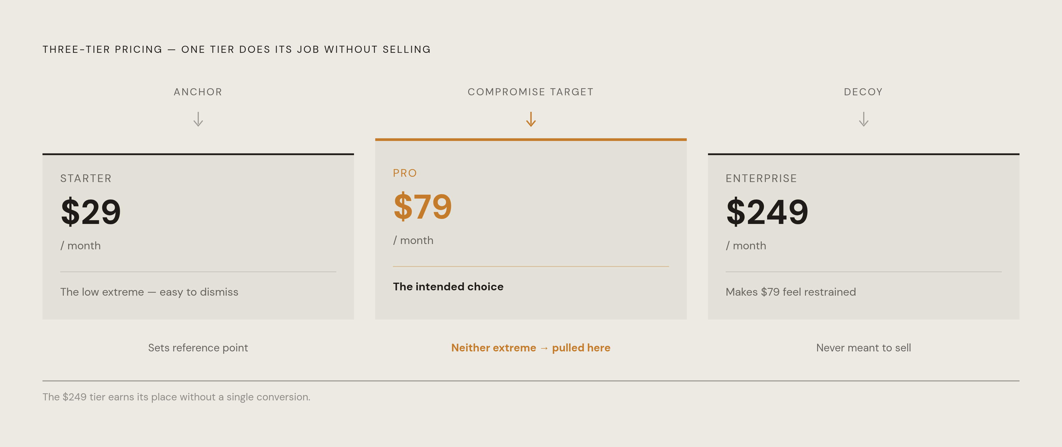
Three tiers reads as simplicity, but underneath, it's three psychological triggers firing at once, each reinforcing the other two, and the layout is not an accident.
The top tier sets the anchor, so the middle tier reads as reasonable by comparison. The compromise effect does the rest: people avoid extremes on instinct, so they drift toward the middle option whether or not it fits how they'll actually use the product. That top tier was never built to sell. It's a decoy doing the job of reframing everything underneath it.
Map this against a real pricing page and it clicks fast. A SaaS platform priced at $29, $79, and $249 isn't hoping to close Enterprise deals at $249. That tier exists so $79 feels sensible, almost restrained. Skillshare runs the identical play, showing a $159/user/year team plan before the $99/year individual plan. Nobody buying for themselves needs the team plan, but seeing it first recalibrates what individual access is supposed to cost.
A 2025 benchmark of over 100 SaaS companies found that businesses running 3 to 4 pricing tiers outperformed those running 5 or more on monetization efficiency. Add too many tiers and the contrast that makes anchoring work gets diluted; the brain stops comparing and just stalls out. A 2024 case from a language learning app shows the same thing from a different angle: adding a higher-priced "Plus" tier increased conversions to the mid-tier annual plan, even though almost nobody signed up for Plus. The decoy did its job the second it appeared on the page, before anyone clicked it.
Whatever tier feels like "the one you chose" was very likely the plan the structure funneled you toward, not the one that matches your actual usage. Call it what it is: the predictable output of a layout built to produce exactly that outcome.
How anchoring shapes the perceived value of annual discounts — and how that bar has moved
Monthly versus annual pricing runs the same play in miniature. The monthly number gets top billing, so the annual charge feels like a rescue by comparison, even when it's the number you'll actually pay.
The standard version: a page advertises "$6.58/month," but the real charge is $79, once a year, upfront. That $6.58 figure will never show up on an invoice, and it exists purely to make $79 feel cheap.
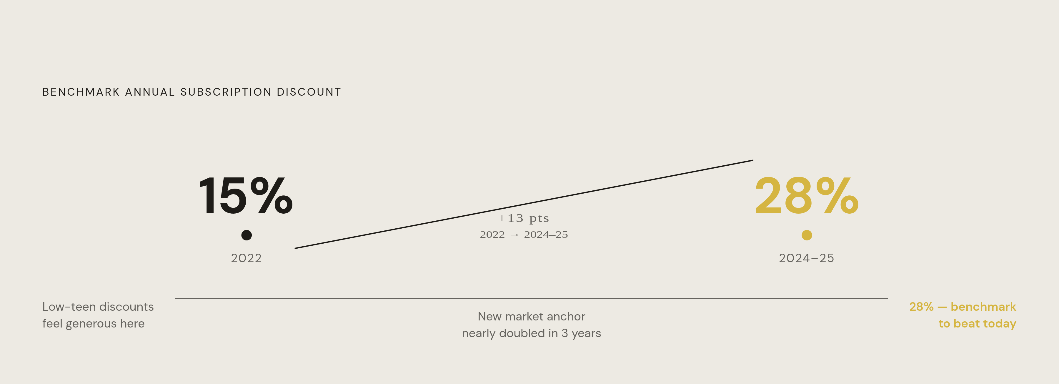
Here's the part worth sitting with. Annual discounts averaged around 15% in 2022 and climbed toward 28% by 2024 and 2025. A 15% discount that used to read as generous now reads as stingy, because competitors trained the market to expect nearly double. That's anchoring at the market level, not just the page level, and any platform still sitting at the low end of that range is betting you haven't noticed where the range moved. Most people haven't.
Charm pricing, the $X.99 trick, plays backup here. It's a supporting tactic, but it pulls the same direction: making a price register as categorically lower than the round number sitting one cent above it.
What subscription anchoring costs consumers in aggregate — and why most don't notice
Mastercard found that 44% of U.S. consumers spent more on subscriptions in 2025, averaging $1,887 annually, up from $1,416 in 2024. That's a $471 jump in one year, and inflation covers some of it, not all of it; the rest is the accumulated residue of tier upgrades and annual lock-ins that anchoring nudged people into, one decision at a time.
West Monroe's numbers sharpen the picture: U.S. households spend around $273 a month on subscriptions, and 89% underestimate that total. That gap is the whole mechanism working as intended. Anchoring trains you to judge each subscription against the premium tier sitting next to it on the page, rather than against your actual monthly budget, so the number in your head stays wrong on purpose.
Average monthly churn has climbed to 20%, and a significant share of subscribers across platforms sit inactive while still paying. Somebody is paying for a mid-tier plan they anchored into months ago and stopped opening around week three; the middle plan felt like the sensible choice next to an expensive anchor, and that original sense of value sticks long after the actual use has stopped. Cancellation, when it finally happens, is the correction anchoring delayed.
The secondary anchoring embedded in "featured" labels, crossed-out prices, and visual hierarchy
A "Most Popular" or "Best Value" badge is a social proof anchor. It tells you what other people supposedly chose, and it reanchors your evaluation around the labeled plan instead of your actual needs. That's exactly the point of putting it there, and it works whether or not the label is even true.
Crossed-out "original" prices are blunter still. That reference number might have been briefly real, might never have been widely available, or might have been set high specifically so it could get crossed out later. Either way, you're handed a number to anchor against, and it isn't neutral. Treat it as a prop, not as information.
Visual hierarchy does more work than most people credit it for. Premium tiers get more column space, bolder type, longer feature lists, often padded with features nobody uses, and prominence stands in for quality whether or not it's earned. Feature lists get built asymmetrically too: lower tiers get described by what's missing rather than what's included, so the mid-tier reads as relief from deprivation instead of a product judged on its own terms.
The fix is mechanical, and it takes deliberate effort to push through more than once. Read only the features of each plan against how you'll actually use the product, and ignore the crossed-out price entirely, then ask what the middle tier would feel like if the expensive tier weren't sitting next to it. If the answer changes, the badge was doing the work, not the product.
How free trials and upgrade prompts extend anchoring into the post-signup experience
Anchoring doesn't stop at signup, and it doesn't stay still either. It changes shape and follows you in.
Free trials usually unlock full premium access, which sets that top tier as your baseline before you've paid anything. Downgrading to a cheaper plan afterward doesn't feel like a rational adjustment; it feels like losing something you already had. That's loss aversion riding on top of anchoring, and it's why trial-to-paid conversion carries so much of the psychological weight in this whole system. You've already accepted the product's value at a $0 anchor, so the cheapest paid tier feels like a real jump while the mid-tier feels like "well, I'm paying anyway."
A report from Bango found 53% of AI subscribers cancel and restart tools as needed, a workaround that treats the trial period itself as the actual product. That's a rational response to an irrational system, and it's telling that so many people arrived at it independently. Upgrade prompts inside locked features pull the anchor from the other side: right when you hit friction, the tier comparison reappears, and you're staring at the original anchor while frustrated, which is precisely the wrong emotional state for a clear-headed decision.
The FTC's Click-to-Cancel rule, effective late 2024, fixes the exit side by requiring cancellation to be as easy as signup. It says nothing about the upgrade path, where the anchoring still runs unregulated, and that's the half of the funnel actually worth watching.
Recognizing an anchored pricing page in practice — what to check before committing to a plan
Run these checks before committing to anything, and take them in order.
Find the anchor first. Ask which tier is doing perceptual work instead of commercial work: a plan priced way above the rest, built for an enterprise user you clearly aren't, is functioning as the anchor rather than as a real option for you.
Then invert the page. Read the cheapest tier first, against your actual usage, before your eyes hit the expensive stuff. That resets your reference point before the layout can set it for you.
Convert every annual price to the real lump sum next. Ignore the "$X/month" framing and ask whether you'd hand over the full amount upfront for a product you haven't used yet, then check the annual discount percentage against market norms while you're at it. A discount in the low teens, when competitors sit closer to 28%, is a gap the platform is counting on you not noticing.
Last, look at what's locked out of the tier below. Are those missing features things you'd actually use, or just enough deprivation to make the upgrade feel necessary?
Tools built to track subscription spending can run this check passively, flagging cases where someone's paying for premium but only touching basic-tier features. Compass+ works this way, surfacing the gap as a specific dollar figure with a next action attached, rather than leaving the whole audit to memory. The goal is matching the plan to actual usage, not the usage pattern the page was built to make you imagine.
Why subscription anchoring works better over time — and what ongoing surveillance actually requires
Anchoring strengthens with time rather than fading. Once you sign up, the mid-tier price you picked becomes your new reference point, and every price increase after that gets measured against that number instead of zero. That's exactly why a moderate increase slides through without resistance.
Creeping bills, for this reason, are one of the most common ways people bleed money without noticing. The mental anchor for a subscription stays fixed at the original discounted or introductory rate, and most people can't recall that number precisely enough to catch the drift when it happens.
Subscription sprawl multiplies all of it. U.S. households average four premium AI subscriptions alone, running around $66 a month combined, and each one got anchored separately at its own signup moment. Every renewal after that gets judged against the tier "already chosen," not against whether it's still needed.
This is a permanent feature of the environment, not a one-time trap you solve by being careful once. Manual auditing doesn't hold up against it; 89% of people already underestimate their own subscription spend, and the whole anchoring mechanism is built to make each individual charge look reasonable in isolation. A single careful decision at signup does nothing against a bill that drifts upward eighteen months later, which is the actual failure mode worth guarding against, not the initial sign-up price.
That's the gap passive monitoring exists to close: something that connects to bank accounts and subscription services, flags unused plans, catches quiet price hikes, and surfaces tier mismatches, doing the ongoing work that anchoring requires and that nobody sustains by hand for long. Compass+ runs on that model, surfacing each finding as a specific dollar amount with a clear next step, without asking for continued effort once it's set up.
Knowing how anchoring works doesn't switch it off. The neural response fires before rational evaluation starts, the same way in someone who's read every line of this as in someone who hasn't, and what changes, once the mechanism is out in the open, is which tool does the ongoing watching.